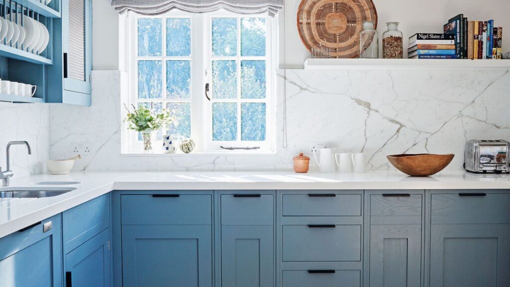
UPDATE: Powder blue is officially taking over kitchens, as Jennifer Garner showcases this dreamy hue in her latest home reveal. The actress’s recent post highlights a stunning wood-and-blue kitchen, making headlines just hours ago.
This shift from traditional navy to a lighter, fresher powder blue is not just a trend; it’s a movement toward creating calm, inviting spaces as we approach Autumn 2025. Garner’s kitchen, blending the coolness of powder blue with warm natural wood, offers a restorative and luxurious feel that resonates with homeowners seeking a brighter, more optimistic palette.
Interior designers are embracing this softer shade, emphasizing its versatility and timeless appeal. According to designer Nina Lichtenstein, “Blue is universally associated with calmness, making it an ideal choice for spaces where relaxation is key.” Her insights reveal that lighter blues evoke the serenity of a summer sky, making them perfect for kitchens, where comfort is paramount.
Experts recommend balancing the boldness of blue with lighter finishes. Lichtenstein advises pairing powder blue cabinetry with white or light countertops to enhance the overall ambiance. This combination not only lightens the space but also accentuates the rich color of the cabinets. Garner’s kitchen exemplifies this principle perfectly, serving as an aspirational model for those looking to update their homes.
Trending Now: The Sherwin-Williams 2025 Color Collection introduces shades like Quietude and Delft, which echo the calming vibes of powder blue. These colors are designed to create environments that feel both grounded and airy, aligning perfectly with the current home design trajectory.
In a world where home aesthetics are evolving, powder blue is emerging as a key player. The color’s subtle vibrancy adds life to classic designs, and when combined with natural materials like oak or walnut, it achieves a sophisticated yet inviting look.
For those looking to replicate this trend, here are some expert do’s and don’ts:
Do:
– Consider the undertones. A powder blue with gray undertones feels timeless, while a green-tinged blue offers a fresh coastal vibe.
– Pair with natural materials to prevent the color from feeling overly sweet or cold.
– Use blue strategically to create focal points in areas like kitchen islands or breakfast nooks.
Don’t:
– Overdo the pale blue. Balance with warm woods or rich marble to avoid a washed-out effect.
– Ignore the effects of architecture. In heritage homes, opt for muted, chalky blues that complement period features.
The desire for a fresh kitchen look is not just about aesthetics; it reflects deeper emotional needs for tranquility and warmth in our living spaces. As homes continue to function as sanctuaries, trends like Garner’s powder blue kitchen resonate strongly with homeowners and designers alike.
Looking to make a change? Top retailers have already started offering items that embody this trend. Check out the Martha Stewart Collection 10-Pc. Hard-Enameled Aluminum Nonstick Cookware Set or the stylish Smeg 2-Slice Toaster for a chic touch in your kitchen.
Stay tuned for more updates as this color trend continues to develop and inspire home transformations around the globe. Share your thoughts on this latest trend and join the conversation as more homeowners embrace the beauty of powder blue!